
* keep the colors limited.
- Choose the colors from the photos.
- Use only 1-2 colors and play with different shades, lightness, darkness etc.
- Use "premade paper selections" with different patterns but same colors.
* don't forget the text
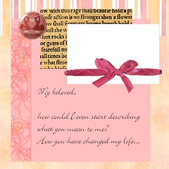
- journaling, explaining what happens in the picture, fooling around etc. is The Thing with scrapbooking albums. It doesn't need to be advanced or fancy, just write down some thoughts of yours, explain wheres, whens and whos, because you WILL forget.
- Use song lyrics, quotes, poems
* don't pack the page with photos.
- Use only one or two on page, preferably only three on a two page layout.
- Photo collage block and photo mosaic block is "one picture"
- Photos with the same subject slightly variated counts as "one picture" as well.
* Remember that the nicest composition is the triangle and that everything must follow the Golden Section rule to look nice.

* Use the embellishments sparingly and wisely.
- In one of my mother's "how to look the best you can" books (from 50's or 60's) there was a "point calculating table". You get a style point of every detail of your clothing and the amount of points should never pass 12 if you are to be stylish. The same rules actually fit for scrapbooking. Your page should have 10-15 points to look good. Less points and it looks poor, more and it looks messy.
You get one point for
- each color
- each different paper used
- each photo
- each lettering
- each individual embellishment element (So if you use buttons, you don't count each button but all the buttons as one embellishment)
Let use this page "Fall Fun" as an example:
Colors: 2 (green and rust)
Photos: 2
Different papers: 7 (the raffia is counted as one paper)
Elements of design:
- inserted strips
- 3-D frame
- strips/rosettes of raffia & paper
- leaf
- 2 different letterings (the different letterings in "fall" are counted as one, as it is bound together with color and background paper)
- text strip
- journal box
- wavy shape in the bottom of the paper
- green paper strip at the bottom of the paper
- green paper topper on the other picture
- brads on the topper
- paperflower
- buttons
--------------------------------------
25 points
At first sight the page looks nice, but it would look nicer if the elements were fewer...
For example:
- use only 3-4 papers instead of 7
- skip the raffia and paper strip rosettes
- use only paper flowers OR leaves, not both
- use only one sort of lettering, either the "fall" sort or the fuzzy "fun" sort.
- loose the brads
- use only one sort of framing - either the topper idea or the 3-D frame
- loose the text strip
- use the inserted strips idea on the bottom of the page too
and now we are on 15 points. The page will look less busy and better.
BTW Mackey, the creatrix of this page, creates beautiful pages. (Even this one is beautiful)
Take a look at her gallery :-)
--------------------------------------------------------------
Here's a couple of sources of inspiration:
CraftTVweekly
Scrapbook Dreamer's
- Lisa Spring
Scrapbook.com
Scrapbooking at About.com (not too nice layouts, but good ideas...)
HGTV: Scrapbooking
Scrapbookie
Scrapjazz
diy scrapbooking with Sandi Genovese
"Better Homes and Gardens" Scrapbooks etc.
Flickr:
-The Scrapbook Pool
- Scrapbookin Maniacs
- All the Cool Kids Scrapbook!
- Scrapbooking Português!
A Flickr artist "Luv2scrapmilestones" is amazing... Her layouts are a little wild, but pure art! So inspiring!
Cacau Ferrera is also quite nice :-)
Amy Solovay's LOs (Lay-outs) are quite nice too :-)
---------------------------------
More nice pages for ideas added 14/1-08
Ella Eliisa's gallery
Scrapbooking maniac!
Tara Anderson's scrapbooking and art journaling gallery
Shopping Diva Scrapping and Stamping
No comments:
Post a Comment